Saturday 30 October 2010

I haven't posted in a while because I haven't really been doing a lot. Went through a bit of a transitional point in life in the last couple of weeks and had to deal with some things, kind of meant I didn't feel like doing anything artistic. I was busy sorting out my life.

However, today is a new day. Here are a couple of pictures of my studio. As you can see I have a few bits and bobs on the wall.
I have been reading "The English way of death" by Julian Litten, which has been giving me some ideas of where to take the project.
I have also been reading some texts on the nature of photography for our print seminars. I have been really lucky lately in that the last two seminars have been on photography.

My plan for next week is to make a death mask. Death masks were mentioned in our Visual culture lecture last week and in The English way of Death and the print lecture text. It's a sign.

I know i'm not dead but i can play dead. A death mask is a wax or plaster cast made of a person’s face following death. I will write more about them when I have made one.


Also noticing that the campus / university is really beautiful at this time of year. Gold and green and covered in leaves. Makes me want to go there.

Saturday 9 October 2010

Graves, Royston


Graves, Royston, originally uploaded by Laura E Gardner.

Finally developed a few more of the grave pictures. I took this one in Royston. I liked these ones, they were kind of dark and mysterious. Black and white definitely can change the mood and tone of a picture completely.

I'm going to be mostly taking pictures in black and white this semester as i have access to the dark room. I also want to fully master black and white film. I have some cool ideas for techniques i want to try out in the darkroom over the coming months.

Friday 1 October 2010

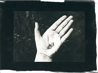
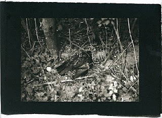
Platinum and Palladium printing


On Wednesday I took a workshop, near Cambridge, in Platinum and Palladium printing.
It was really informative and some of the techniques shown such as digital negative making are also used in other types of Alternative printing processes, which is a useful crossover.

I chose negatives that I am already using for my project, so that I could see the difference with them printed differently.

I really like the effects of platinum printing, my final images were so clear and beautiful and platinum prints have a great tonal range.

I definitely think that this series looks better as a platinum print series. The images look more cold, melancholy and lonely.

I am planning to look into other alternative printing processes too, I will look at cyanotypes next, just need to gather a few things.